

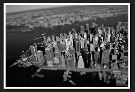

Thanks to mobile image editing apps like Instagram, the faux tilt shift fad seems to be at its height. But why should we let iPhones have all the fun? Let’s bust out a tilt shift effect using pure CSS.
In this tutorial, we’ll learn all about the new CSS filters in Webkit and how to implement an image mask in CSS. We’ll then use these techniques for our final tilt shift effect. We’re going to hit on all kinds of crazy stuff so read on and we’ll have some fun.
Over the past few years, CSS has been ever so slowly taking over the areas that we used to turn to Photoshop for: gradients, rounded corners, shadows, etc. Recently, Webkit took a big leap forward in this area with the introduction of CSS image filters.
What if you could alter the saturation, contrast or even blur of an image using pure CSS? The possibilities would be awesome. Prepare yourself, because you can do exactly that with a quick line of code.


 Your new post is loading...


Tilt shifts have been talked about, in the CSS world lately. And why not, it gives off a transatlantic vibe from the 1930's - 1940's. Fantastically, Webkit has taken a huge leap in the right direction.